- LTD "Rubicon" specializes in the production of high pressure hoses, industrial hoses and pipes for various purposes, complete deliveries of equipment for the production of hoses and hydraulic components such as pipes and tube connections, adapters, fittings, bars, plastic and textile protection for hoses.
VIEW THE WEBSITE
PROJECT CHALLENGE
To develop a website, the purpose of which is to provide the clearest and most useful information about the equipment, the specifics of the company. To make a convenient product catalog with the display of complex technical information.
DESIGN CHALLENGE
Develop a responsive design. Set a strict visual style with a positioning on the credibility and reliability of the company. Make complex technical content as easy to comprehend as possible.
1
Information
Architecture
Architecture
•Kick-off meeting
•Terms of reference as a design brief
•Information architecture
•Creation of wireframes
•Terms of reference as a design brief
•Information architecture
•Creation of wireframes
2
Visual
Design
Design
•Creating a visual concept
•Approval and revisions
•Visual design development for desktop
•Visual design development for mobile
•Approval and revisions
•Visual design development for desktop
•Visual design development for mobile
3
DEVELOPMENT
SUPPORT
SUPPORT
•Preparing files for transfer to development
•Development of element states
•Creation of small UI Kit
•Maintenance and control of development
•Development of element states
•Creation of small UI Kit
•Maintenance and control of development
View the full version of the project on Behance

01 STEP
• Kickoff meeting
• Project Evaluation
• Competitive analysis
• Design principles
• Creation & elaboration of scenarios
• Project Evaluation
• Competitive analysis
• Design principles
• Creation & elaboration of scenarios
- INFORMATION ARCHITECTURE
After drawing up detailed user scenarios, the SiteMap was developed, and the global navigation was defined and worked out. - ?Based on the architecture began to develop low-detailed Wireframes, which cover the basic functionality and scenarios of the site, worked out a card catalog of product filter.

02 STEP
•Creating a visual concept
•Approval and revisions
•Visual design development for desktop
•Visual design development for mobile
•Approval and revisions
•Visual design development for desktop
•Visual design development for mobile
VISUAL DESIGN
After several iterations of approving and improving Wireframes, work began on developing the visual concept of the homepage. At the same time, work on the responcive was underway.
The basis of the visual style of the main color blue, which is used in the company logo, then paired with a red color of the same tone.
In the design of cards, icons, buttons, etc., a radius has been incorporated, that is, all objects have rounded shapes. This move came from the main product Rudicon deals with: high-pressure hoses (the product is based on pipes, circles).
VISUAL STYLE CHALLENGE:
show the seriousness and professionalism of the company, which has long worked in the market of Belarus, but also to bring loyalty to customers.
show the seriousness and professionalism of the company, which has long worked in the market of Belarus, but also to bring loyalty to customers.

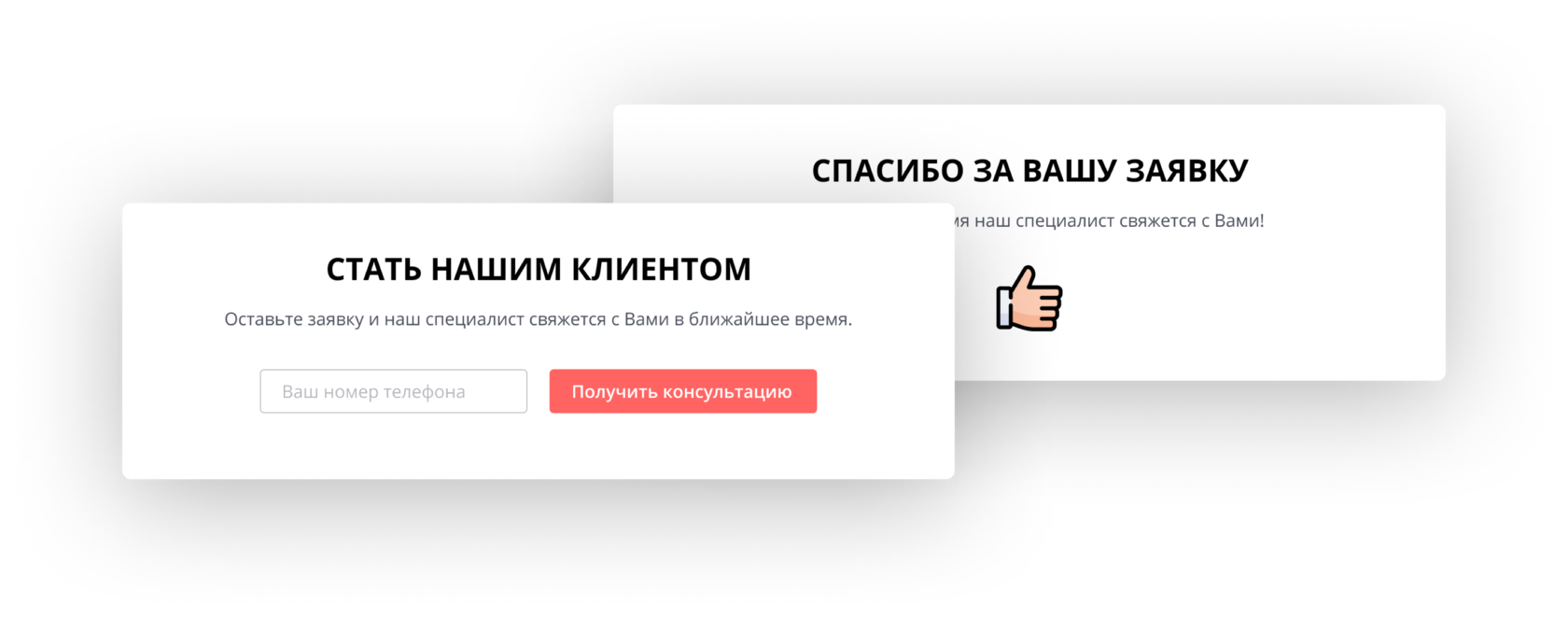
Notifications
and popups
and popups
A number of pop-ups were created, cards with discounts and with alerts of various types. Then they were adapted for responcive.

DEVELOPMENT
SUPPORT
SUPPORT
•Preparing files for transfer to development
•Development of element states
•Creation of small UI Kit
•Maintenance and control of development
•Development of element states
•Creation of small UI Kit
•Maintenance and control of development
After approving all the screens, making changes, checking and working out all the basic user scenarios, I work began on the elaboration of all possible states of interface elements and created a small UI Kit.
Having completed the visual design phase, the files were prepared and transferred to the development team. Then, as the product was being developed, the development team performed design control for compliance with the transferred layouts.
Also, as necessary, small points in the interface, which were difficult to take into consideration during the visual design phase, were fine-tuned.
